Sunday 15 November 2009

Feel good drinks poster


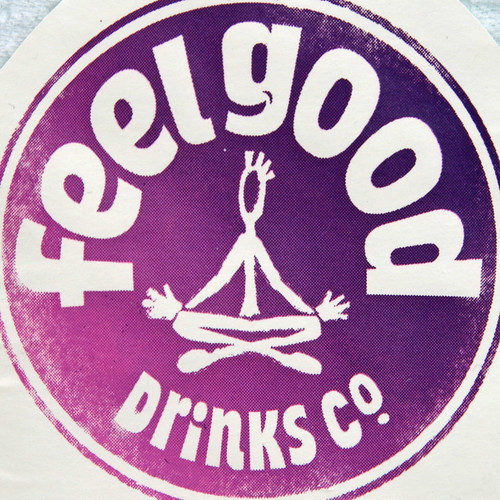
Exploding glass bottle full of feelgoodness. Poster has the bottle bursting with all different things associated with the feel good brand. Its slightly off target with the slick looking individuals and speakers, while the feelgood brand is slightly more innocent and fun.

Feel good drinks - Tropicana


http://www.tropicana.co.uk/

Tropicana goes for the simple fruit approach. It has a slightly more upmarket look with lots of green. It keeps the packaging to a simple white, giving a pure look. The site shows it as part of a healthy breakfast. It keeps it clean and non-gimicy to appeal to a slightly more mature/older audience with no gimics.

Feel good drinks - Ocean Spray

ocean spray mainly focuses on cranberry based drinks. They have a strong ripple based branding. Again they have a healthy approach. They capitalise on the rich colours of the cranberry juice something i could play on with the feel good brand.


http://www.copellafruitjuices.co.uk/
Copella plays on the traditional nature of fruit juices and being a british brand. Using plenty of images of grassy green english countryside. The branding is all reasonably traditional, a lot of use of green. It aims at a slightly older market and plays on the quality of the juice.

Feel good drinks - competitor - Oasis rubber duckzilla


Oasis is another competitor in the fruit drink market. Their product is less aimed at the health market but has a massive market share and can be found almost anywhere. This is in part due to being made by coca-cola. Its not as healthy as the feel good drink and contains a lot of sugar.
Their current campaign is "oasis for people who dont like water" with a rubber duckzilla character. It plays on japanese culture and plays a wierd card. Its certainly memorable but the "for people who dont like water" line is slightly strange and there is a feeling of too much strange for many people.

Feel good drinks - Market Competitor - innocent


Innocent smoothies have the same market and positive spin on the healthy drink market. The logo and cleanness of the packaging make it stand out and its become a household name. They use the same positive language across all their copy. Their website is cleaner yet carries the brand and has a touch of fun in the wiggling links. Innocent smoothies used to be called fasttractor, the change to innocent helped make them a well known name.
http://www.innocentdrinks.co.uk/

Saturday 14 November 2009

Feel good drinks - competition entrant AHDMI204


Reasonably good concept on this entrant, simple premise but has good idea using the fixed camera angle and obviously low budget to good effect. Its a shame he didnt finish.

Feel good drinks - Gnomes competition winner


This is the video that came from the winning competition entry from last years YCN brief. They took the idea from the entrant and made a series of video spots on the same gnome concept. This gives me a idea of the type of feel they want in their video. It doesnt have a solid concept other than the cutseyness of the gnomes making the drink but this carries it through.

Feel good YCN competition - Other entrants


Not a particularly good effort, but the idea is ok, the music doesnt really fit the video, and the idea is reasonably weak.

Feel good initial branding


http://www.chrisparker.info/workview_packaging.php?work_id=1

"Enjoying and celebrating "Feel Good Moments" was the underlying philosophy that went into every stage of the branding, design, advertising and was a consistent mantra that was repeated during the design process.

To nutshell this whole concept I created a character illustration at the centre of the label (nicknamed Felix) who communicates through his poses the functional benefit of the drink. The character was created to communicate a specific Feel Good Moment generated as a result of drinking the product, and featured centre stage in every design.

I also designed the Feel Good Drinks labels with the idea for the whole label to be essentially the corporate logo. For brand personality the character and colour of the label would change for each flavour - a big decision in branding terms as we were essentially changing the logo each time. "

Its very interesting to get some insight into the initial branding of the feel good company so i can try and fit my approach around it. It gives a good indicator of what the company is all about and how their logo is used.

feelgood synonyms

Synonyms:
airy, at ease, blithe, breezy, buoyant, calm, careless, cheerful, cheery, cool, easy, easy-going, feelgood, happy, happy-go-lucky, insouciant, jaunty, jovial, laid back, radiant, secure, sunny, unanxious, unbothered

These are all words that relate to what the feel good drinks company is going for.

YCN feel good competition = Spread the feelgoodness


This animation has a weak concept that doesnt really make a strong point, but the visual style matches the feel good brand reasonably well.

Feel good drinks - Making of the video gnomes


Feel good drinks gnome making of. Its interesting to see the creative process behind the video spot and see how something gets from concept to finished product.

Friday 13 November 2009

Feel good drinks - competition entrant


Simple concept of singing to a camera. Has a bit overuse of the standard mac filters for effect on the video and is more like a music video than a true advert. The message is a little pg-13 as well, and there doesnt seem to have been a lot of thought behind the idea.

Feel good drinks range


The range of feel good drinks are slightly out of the norm, with orange and mango, cranberry and orange etc, and are aimed at a health conscious audience with no added sugar and only natural ingredents. There is a slight health food vibe to the branding and positive message. The colours of the drink are interesting and vibrant and could be used in a campaign. I like the logo on the glass, giving the drinks a good quality product look.

Feel good drinks


The feel good drinks site utilises a faux-hand made approach to the site, it has bright colours and a feeling of innocence and summer. It uses a lot of reasonably cliche imagery such as rainbows, a shining sun and rolling green hills. It has quite a cutesy feel and a positive vibe. This is the sort of market im aiming at, positive, happy and maybe slightly hippy. The site is reasonably entertaining to click through as you are not sure what kind of fun animation could happen next. The feelgood approach could be seen as a little heavy handed, it doesnt pull any punches with its positive message.
http://www.feelgooddrinks.co.uk/

Sunday 1 November 2009

Gatecrasher


Gatecrasher.com
The homepage to gatecrasher has a frustrating flash animation that is annoying and confusing. It also has an annoying cutoff at the fold and there doesnt seem to be rhyme or reason to the news as its not dated and cover very varying topics. The navigation is plain and uninspiring.

Chemical records


Chemical records is a online vinyl and music enthusiasts store from bristol. It aims at DJ's and people into electronic dance music. I find the background white wall effect off-putting and slightly unprofessional but the technical nature of the shop and the pure amount of accessibility is something i am inspired by.

mau5trap


mau5trap is the artist deadmau5 label. It has a name befitting of the artist and uses the strong iconography already in place with deadmau5 to benefit the label too. I think the name could be more considered and flow better, but overall i like it.

Fabric


The fabric site has a lot of information but it manages to keep it reasonably ordered and easy to navigate. By using few colours it gives cohesion to the site and it highlights things that are deemed more important well. It also uses a flash frame to give more interest to the site, and uses it to showcase upcoming artists. It keeps the design consistent throughout and thus has its own feel to it.

Ministry of sound


The ministry of sound website has a simple and effective navigation bar, but below this it becomes messy and your not sure what to look at. It mingles adverts for its own products with useful information and its hard to tell which is which. The colour palette is all over the place and the white fails to bind the whole site together. I like how the club tab the whole page turns black. It does break the site as a whole, but it is a suprising change and turns your attention to that tab.

godskitchen


Godskitchen is content based and has a lot of windows. I would say its quite busy and confusing,but it fits a lot of information into a relatively small space. It uses a small frame so that people can view it on several different resolutions without problems. It uses some flash windows to give some movement and novelty to the site. It also uses rollover buttons, it makes the site seem move alive and interesting. It possibly has too many moving pieces as it can be a little confusing.

www.godskitchen.com

Friday 30 October 2009

Sub focus - Drum and bass


Very nice design from subfocus here. The image is centred around the circle that is reminicent of a speaker cone, but also has colours playing around it. The sub focus logo is clean and clear and the whole cover draws you in with the simplicity. It also reminds of an iris, so captures the Sub and the focus in the name in a way.

Tuesday 27 October 2009

RAM records - Drum and Bass


RAM records are one of the biggest labels in drum and bass. They put on RAM record only tours as well as having some of the biggest names in drum and bass signed to them. Drum and bass has a lot of simularities to dubstep and dubstep promotion. It is music that also often relies on a bassline to carry the music, and several drum and bass producers make music for both drum and bass and dubstep. Drum and bass has been around for longer and has its own often over the top design for its promotion.
The ram record labels is again simple using only one colour but can be used across any range of things or modified into a design. The abstract curves of the design relate to a rams skull and all the imagery that conjures. The type used is all in capitals and is a strong sans-serif font, it feels uncomprimising. Drum and bass is a often macho genre, with a lot of big-talk and often the design reflects that.

House/electro design


When Love takes over vinyl cover. This is a good example of the direction a lot of electro/house covers are taking. Playing with type, bright colours and typography. Geometric shapes are often used. David Guetta has his own logo using the thin lined minimal font, this is often used in this genre. Its bright yet smart, reflecting the music. The look is a bit overdone now and has been used for a few years since the "nu rave" scene first developed.

Positiva - House Label


Positiva is a house label that releases some of the biggest house tracks in the uk today.
Their logo design is simple but effective. A + sign with positiva in the middle. Its easily recognisable, and works well on the circular media its often added on such as the middle of vinyl, CDs and the like. Its clear and works with just the one colour. It can also be played with such as the other image above for a more dramatic look. Positive is often what the music is, uplifting, and is relflected in the name/logo. A sans-serif font is used thats bold and easy to read.

Monday 26 October 2009

stereotype logo and release


Strong branding from stereotype. The logo is distinctive and includes a element (the S) thats recognizable on its own. A lot of record labels have very distinctive logos that can then be applied to various media. The audience often buys merch such as stickers, t-shirts and the like so something that works and is considered cool to the key demographic (18-25 clubbers) is a success. With this release cover the logo is enlarge and abstracted slightly with vibrant colour and strong rounded lines that break it up giving it a bold distinctive feel. The colour use reflects the vibrancy of the music, and the design works perfectly for the format.

10 tons heavy compilation


10 tons heavy is a dubstep compilation. Dubstep is often designs as pushing heavy, as the music itself is very bass heavy. The name comes from this. The font used is heavy set bold and reflects that feeling. Its also rounded and playful that lends a less intimidating feel to the cover than if it was squared or displayed in a different way. The background image is of heavy moving vehicles against a cloudy sky. The whole image is dark and moody. This dark and moody feel is often what dubstep art aims for. The vehicles are another reference to the "heavy" of the title. The imagery is slightly obscured and gives it a slightly abstract feel.

hyperdub logo


Hyperdub logo is a logo that really works. Its futuristic yet simple, it has an experimental vibe that really links with the record labels releases in dubstep, which are dark and experimental and boundry pushing. They keep the graphics consistant so there is a brand identity across the whole range that ties it all together and says "hyperdub". There are elements of japanese design, which has always been seen as a nation with future tech. The logo is only one colour and would work in any situation you would be likely to put it in.

Higrade002 projectiles


Many small labels only print on the vinyl itself and dont have a proper cover for the vinyl. This is something i may have to think about when designing and have a vinyl centre that works on its own terms. This design for higrade002 is basic but works well when the vinyl is playing as the "blade" spins around. Considering how the record is going to be used is something i need to consider in my design. The blade is also the record company logo and promotes the label clearly on the shelf.

5 years of hyperdub


This is the album art for the 5 years of hyperdub album. It reflects the experimental nature of the music on the album and the record label. The glitchy art style looks simple at first glance but is reasonably intricate. It has a strange style of marking 5 on the cover, futuristic - hyperdub are experimental and always looking to the future. It also fits in well with the rest of the hyperdub art. I feel they could of done more with the tracklisting as it is basic, but readability is an issue especially for working DJs and this is something i need to think about when designing vinyl and CD cover art.

Friday 23 October 2009

Digital Soundboy Recordings


http://www.digitalsoundboy.com/

Another record label, the site and logo are average, has the digital style font you would expect but the way the letters link together looks a little second rate.

Subsoldiers


http://www.myspace.com/subsoldierz
Horrible design on the subsoldiers website, tiled subsoldier text with no consideration for colour of the look of the overall site.
The logo itself is crisply designed as vector art. It gets over the feel of the label, but the type choice is lazy and theres little thats edgy about the design.

D-Style Recordings


D Style is the brainchild of d&b stalwarts Jon Midwinter and Alistair Vickery aka D*Minds.
Originally set up in 2002 as a vehicle for releasing their own tracks, the label has recently started flexing it's A&R muscles and has branched out into signing artists. The first signing TC, under the guidance of the label, has become one of the biggest artists in dance music. In addition to TC, the D Style Group has signed Jakes, The Force and Eddie K to the label, set up it's own publishing company and promotes Run which is one of the most successful drum&bass nights in the UK.
http://www.dstyle.co.uk/

A slick website from D-Style, it fits within the 800x600 resolution so should work on any computer. Its partially in flash it has strong branding throughout with the use of the d-style logo, but it could be considered a bit generic from a design point of view. Its nothing fresh or cutting edge. The incorporated music player is a nice touch, and online store, Djs bios and info feed are all elements that i need to include in my website design.

Hench Records


Hench Records - http://www.myspace.com/henchstep

A Dubstep label started in 2007 in bristol by the artist Jakes. Their logo is in a gangster-like old english font with some stylistic flair detailing. The crown is traditional to hip-hop and graffiti to show the "king" or head of an area, scene or idea. The design is nothing original but would appeal to the perceived fan-base of dubstep music. It often trades in macho and dark imagery. HENCH stands for Hard Earned Never Caught Hustling. This again trades in on the gangster image they want to portray. The type has a slightly grungy, worn look. Hench is also slang for big, and this label goes out to come across as big, cool and aggressive.

Tempa Release 038- Headhunter Vinyl cover


Tempa038 release - headhunter.

Simplistic graphics but bold. A cutout shows the colour of the vinyl underneath. Coloured vinyls are normally only for a limited run of the first pressing and is something that would get a buyer interested. This is part of a set of 3 releases, each one has a different colour, purple, orange and pink. The headhunter written on the sleeve has been partially cut off. A reference to the headhunter of the name. A clean design with a small joke. Headhunter is reasonably famous to dubstep DJ's and the market is specialized to DJ's who would know his name anyway. By doing this the buyer may feel "in the know" to his name. Expecting some prior knowledge could highlight the exclusivity of the record.

Tempa Record Label


http://www.tempa.co.uk/index.html

Tempa
Tempa (2000-present) is a dubstep and garage record label run by Ammunition Promotions, out of the Truman Brewery, East London. Tempa are considered to be one of the founding labels of the dubstep sound, and are part of a larger umbrella of labels (including Soulja, Road, Vehicle, Shelflife, Texture, Lifestyle and Bingo) and club events (such as Forward>> held at Plastic People in Shoreditch) run by Ammunition.
http://en.wikipedia.org/wiki/Tempa

The logo is helvetica extra bold italicised with the kerning tightened. The italics give it a sense of moving forward and helvetica is recognisable as a commonly used for clean graphics and signs. Its been modified enough that It isn't recognizable as the standard font. It would work on different colours and backgrounds and its easily readable. The label has been around since the beginning of dubstep, and it has a sensible timeless feel that reflects the label.