basic idea for the site is separate sections for communication, the home, power, the natural world and the city and predictions from each section backed up from research on the internet.
Beautiful online flash portfolio. Folding booklike design is intuitive and interesting. Work is cleanly presented and the moving format adds novelty without being overbearing. The logo for the agency is sharp and is used well in context and becomes slightly interactive.
Hesperian.org is a publisher of books for charities, including "Where there is no doctor" and Where women have no doctor; two of the key texts i am getting my infographic information from. These come with their own graphics which may or may not meet the final cut for the flipbook.
"so you need a typeface" by Julian Hansen infographic. Solid infographic flowchart; reasonably humorous and easy to follow/ decent use of space; but could be made more interesting and draw you along to the different areas better.
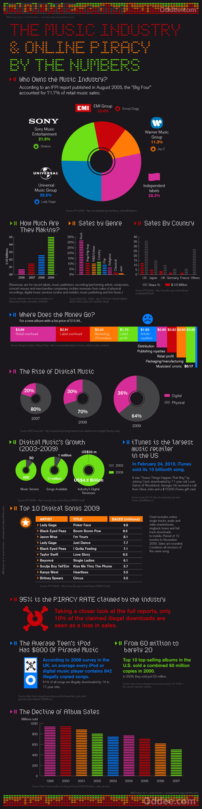
Clean and themic infographics on the music industry and online piracy. The appropriate use of digital style type and the use of equaliser style bar charts gives the whole piece a overarching theme that works well. The use of colour is interesting and draws your eye to key points in the infographic. The breakdowns are easy to understand and note the trends. Structure of the whole piece works well and the information moves between each progressively and interestingly.