Showing posts with label HSamuel. Show all posts

Wednesday, 28 April 2010

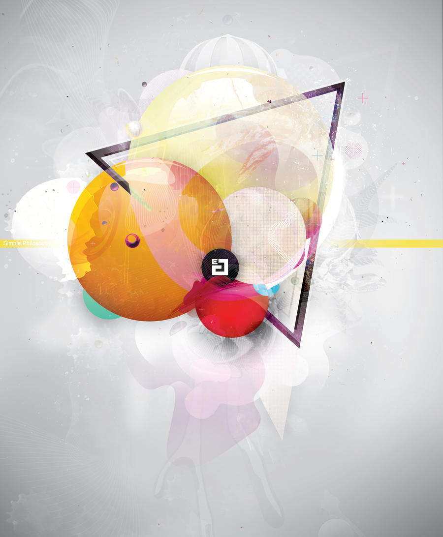
Simple Philosophy


http://jayve1.deviantart.com/art/Simple-Philosophy-161190851

Clear yet complicated design by Jayve. - Jerome van Eerden. I love how the whole image focuses in on the logo in the centre. The whole piece has a strong composition and uses colour well to draw focus to the centre of the artwork. Strong use of geometric shapes and layers has produced a magical image.

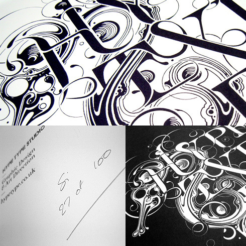
Si Scott


www.siscottstudio.com

Inticate and complex illustrative typography and illustration by Si Scott. The clear cut black and white really focuses the eye on the complexity of the illustration. Hand drawn and scanned.

Monday, 26 April 2010

Dan Funderburgh


http://www.danfunderburgh.com/

Beautiful intricate designs and prints by Dan Funderburgh. Dan Funderburgh is a wallpaper designer and artist in Brookyn. Strongly rooted in the decorative arts. His designs have a very delicate complex quality to them. They have a slightly embossed look that adds to the intricate look and quality of the overall finish. The strong use of red on white gives a clear and stunning impact and really highlights the detail that has gone into the designs. The use of a turquoise backdrop contrasts nicely with the strong colors of the main piece. The designs i think would appeal to a older teenage girl audience as they have a fun fancy almost retro quality to them, while still maintaining a high level of polish.

SWAG - jewelry london


http://www.swaguk.co.uk/

Swag, a chain of jewelry stores in London, has a more playful take on company names. The SWAG logo still keeps to reasonably traditional grounds; namely name over a ----est 1974---- line; this style is reasonably uniform over all the different jewelry stores. All the companies want to give a sense that they have been around for a while and can be trusted; They also stick to solid branding with not very much playfulness within the logos; they are serious and austere. This means it doesnt distract from the pieces they are selling. The site itself has a similar feel to the tiffany's site. It uses subtle variations of purple and white. It has well photographed showcases on the latest lines and it is accessible and sells itself well.

Tiffany & Co.


http://uk.tiffany.com/

Tiffany and co. Has a simple uppercase serif typeface, with a sense of age, respectability and class behind it. It also has a slightly timeless feel. This reflects that expensive pieces could be passed through families. Tiffany & Co. is a strong brandname and their trade isnt located within the label; it has a more exclusive feel to it. The website is smart and minimalist; giving room for the jewelry to shine. The Jewelry is laid out artistically with strong composition; it feels like care has been taken in every part of the site to give a superior viewing experience. It doesnt just lay out everything haphazardly.

warren James - Jewelry


http://www.warrenjames.co.uk/

Warren James have a handwritten/calligraphic logo. It still uses the sans-serif "jewellers" in uppercase that the vast majority of jewellers seem to use. The flowing typeface looks almost like a signature. It has a certain sense of sophistication to it. I like the long L that underlines the warren as well as the striking straight line running underneath the whole logo. The mainpage to the site is a photographic composition of the bead and charm rage of warren james; and reflects a image of london and city living; with some glamour. I think the whole image is let down by the "the charm company" text around the london eye. It looks tacky and out of place with the glamourous nature of the rest of the scene. A lot of top quality photography with models is used in jewelry promotion. This is to provide aspirational "looks" to potential buyers. and show off the jewelry to its full potential.

Kabiri


http://www.kabiri.co.uk/

Kabiri logo uses a widely spaced all uppercase sans-serif logo. It has a strong modern feel to it with good balance on the letters. The site is smartly designed with slight gradients of grey into white; some some highlights in gold. The site aims for a modern yet sophisicated look and i feel it achieves this to a large extent. I could see this modern branding putting off some of the target audience for the sammy's brand as it isnt playful or fun enough. I think the aim is a slightly older stylish group, not a overly young one.

Chapelle Jewelry


http://www.chapelle.co.uk

Chapelle is a discount jewelry store with 24 locations in the UK. The logo and site are mainly green; but the green is a racing green; it has some sophistication to it, but it is handled poorly on the website, it clashes with the heavy red sale text; and has a bit of a Christmas feel to the whole site. The logo is a warped chapelle over jewelry. There is a slightly french feel to the name and the type; but the typeface for Chapelle seems to be warped to little reason and it doesnt add anything to the overall effect of the logo. The site is ulitarian at best. But it is accessible. It has a no-frills style approach and sells jewelry cheap; this could be an attraction to the younger audience. I feel a sense of fanciness and wonder would go down better with the audience im aiming at; selling the product as something special and getting across the idea that if you wear the jewelry you are special too.

Beaverbrooks


www.beaverbrooks.co.uk

Another high-street jeweler. Beaverbrooks has a reasonably thin, serif typeface for its logo; along with a ornate B within a circle. It uses the traditional logo setup of large name over -jewelers- which seems to be a common link between many of the top jewelry retailers. The site is a slightly ugly brown. It uses a pattern of the B Beaverbrooks logo but it is low resolution and doesn't look high quality. It has cutout box adverts similar to the other sites, but there is a decidedly more tacky quality to the website. It uses a purple or pink colour on a lot of its range adverts and information text. The circled B works reasonably well as a logo, as its small and simple yet quite recognisable and is applyable to nearly any range of product or promotional material on any colour.

F.Hinds


http://www.fhinds.co.uk/?source=aw

F.Hinds has a very similar logo style to H.Samuel; and a likeness to goldsmiths as well. These are all long running jewelry stores. This type of logo seems to be a traditional almost serif type that is common across the spectrum as showing a sense of trust and long running tradition within Jewelry stores. The name and design have a old, family run style to it . The site uses mainly white to showcase the jewelery against, with a muted red/purple for the detailing. Each company hasnt strayed far from the purple tones. The site again is very accessible and is based around getting people to see as many products easily as possible. The logo i would say is too stuffy for a younger audience who see jewelry as more fun than serious gift pieces and wedding related jewelry. This should be reflected in my rebranding of H.Samuel.

Goldsmiths Jewelry


http://www.goldsmiths.co.uk/

Goldsmiths have also gone for a purple style site. This time in black and purple with gold highlights. Again this reflects a sense of status and class with the jewelry. As Goldsmiths have a slightly more up-market aim as well; they want to avoid looking too tacky and want to put across a sense of class and sophistication that can be seen to rub over onto their product. All the sites i have visited so far have had compartmentalized adverts across the site and the mainpage that hope to draw your eye to a certain product. They are consistently trying to attract you to the jewelry. The woman on the main page sells a classy look and sets a tone for the whole site.

Accessorize


http://www.monsoon.co.uk/page/acchome
Accessorize is another company that aims for the same age group as this H.Samuel campaign. Their logo is slightly whimsical and fun while still keeping enough rigid structure to be serious. The crown over the I gives a subtle hint at being the king/queen of whatever they are selling. The sites heading bar uses a intrecate almost formal pattern in shades of black and grey that adds to the feminine feel to the site.
The leading image on the accessorize homepage is 2 teenage looking girls in a lot of accessories/jewelry looking reasonably glamourous/pop. This has allusions to celebrity style advertising imagery and its noticable that celebrity culture is a big influence on the target audience. There is also heavy use of hot pink in the imagery, a traditionally feminine colour.

Jewelry Trends 2010 - More


http://jewelrytrends2009.wordpress.com/

More trends in jewelry including celebrity trends. With the teen age group im aiming for with this branding, they often take lead from celebrity fashion. A lot of the campaigns ran have a celebrity face to them as this is one of the things that attract that audience the most.

Chains, chunky layered necklaces with big beads or gems. Some vintage charm like necklaces and bracelets, rings with 1980's inspired themes, or edwardian style jewelry is trending in 2010.

More Jewelry Trends spring 2010


http://fashionstyletop2010.blogspot.com/2010/03/jewelry-trends-2010-spring-colors-and.html

The spring colors are going to make an impact soon. Making sure that the gemstones worked in to your jewelry match up to the up & coming spring clothing lines. Most exciting for me are the purple based pastels that are due to have a major impact with styles this spring

With my design i want to make sure that the colours and style of the promotional material doesnt stray too far from the current trends of what H.Samuel will be selling. It seems that bright colours are out and more pastel colours are in, with the colours of metal jewelery such as gold, silver, platinum, with muted gems are in this spring.

Jewelry Trends 2010


Jewelry Trends 2010

http://hubpages.com/hub/Trendy-and-Tantalizing-Jewelry-Trends-2010

Gold is a valuable metal, so is gold jewelry. Even when gold prices are at an all time high, demand is not showing any signs of sluggishness. Although numerous other metals such as silver, platinum, brass are in use for jewelry purpose but none of these is even close to the popularity of gold.

The matching sets of the bold jewelry are going to be hit in the upcoming year. Bright colors are out of fashion. Buy unique, exceptional pieces.

Light color jewelry is the expected trend for 2010. Look forward to bead bracelets in black, white, gray and blue.

Skyrocketing gold prices will give way to gemstone jewelry. It look pretty with its colorful designs and patterns. A huge variety is available: crystal, coral and turquoise etc. It comes in different colors and affordable price that allows you to change it frequently.

Beaded Jewelry: Beaded jewelries are in demand and getting popular these days. They are available in various patterns and designs. These jewelries are great way to impress your beloved ones.

Handcrafted Jewelry: Handcrafted jewelry looks stunning and their designs are fabulous. So you have quite diverse options. The boldness and color of such jewelry makes it different and exclusive. Most of the women opt for these jewelry because it is fashionable and trendy.

Austrian Crystal Jewelry: Crystal jewelry is available in diverse colors and designs. These jewelry items have different radiant characteristics like a crystal ring which signifies self confidence and boldness, grace and elegance. They are available in all designs from pendant to earrings.
Saturday, 17 April 2010

Shine Logo


Shine - This logo has a bespoke quality to it that is very appealing, it is complex and detailed, and some could get lost in sizing, but it has a lot of impact, and by incorporating the shine name into the middle of the chandelier like form, it brings together a modern look with a more traditional one. This style of using more fancy shapes and combining with the modern works well.

Moxie Sozo


http://www.moxiesozo.com/index.php?t=feature&id=36&type=packaging

lovely feminine design by Moxie Sozo.

"Nuun is the leading manufacturer of electrolyte sports drink tablets. After establishing a strong reputation with endurance athletes, the company hired Moxie Sozo to launch a new product targeting the health-conscious women’s lifestyle market. The agency, through research and focus groups, identified competitive challenges and opportunities for the new brand. Using a graphic architecture centered around a dynamic female form, contemporary styling and a fresh color scheme, ‘U’ capitalized on key emotional drivers of the target audience, while maintaining taste appeal and a strong shelf presence. The packaging has won several awards, been featured in numerous books and received praise for its effectiveness."

Lucy Hargrave -- soapworks


Beautiful work by lucy hargrave http://www.lucyhargrave.com/

Intricate and more beautiful than the product it contains, this packaging could and probably would be kept long after the soap is finished. By cutting out the negative space to create intricate patterns and then using coloured inserts inside to give each its own colour in the set, relating to the colours of the ingredents of the soap. Each package is a keeper.

Logos - girl


Logo designs centring on a teen girl style approach.

Yunohac - has a simple almost cutesy cartoon look, the colours are colourful without being overwhelming and the typeface is sans-serif and has illusions to handwritten type. When aiming at a younger teen audience people often identify with characters that are more relatable than symbols.

gel's kitchen - again use of pastel colours to give a overall feel. The logo has a lot of detail but its quirky and fun. Again the type is slightly hand written. Hand written can often give something a more creative "girlish" touch to a logo, especially when used with other elements.

Mary and Andy - two people kissing, evoking a almost Parisian style and love, the whole thing wrapped up in a heart. Again a almost handwritten typeface. The female face is strange but this adds character to the image.

Handwritten logos


A collection of hand drawn almost callagraphic logo designs. When done well they give a humanity to a logo, and often a touch of class and pride. They flow well, and have a character of their own.

Seuda Jewelry - The Curling S letterform gives the logo some flair, the whole thing looks almost signature like in its flow, The contrast between the serif letterforms of the jewelry and the flowing script works well together. The S hints at a necklace which reinforces the jewelry brand while doing it subtly enough that it stays classy.

est. - I really like the flow on this logo, it stays easy to read, but has a clean look thats very well balanced. It would work on any surface.

Giulianni ristorante - flowing and rustic, looks handmade but with care, a good reflection for a Italian restaurant. I would say that the ristorante works nicely but maybe slightly illegable at a smaller size, it also seems slightly detached from the Guilianni. The crimson backdrop adds to the classy overall look of the logo.

Shiraz wine logo - hand drawn then scanned into illustrator. It flows well and works with the balance of the loops of the S and the Z. It still maintains legibility.