Hesperian.org is a publisher of books for charities, including "Where there is no doctor" and Where women have no doctor; two of the key texts i am getting my infographic information from. These come with their own graphics which may or may not meet the final cut for the flipbook.
Showing posts with label Charity. Show all posts
Tuesday, 4 May 2010
Hesperian.org
Hesperian.org is a publisher of books for charities, including "Where there is no doctor" and Where women have no doctor; two of the key texts i am getting my infographic information from. These come with their own graphics which may or may not meet the final cut for the flipbook.
So you need a typeface..
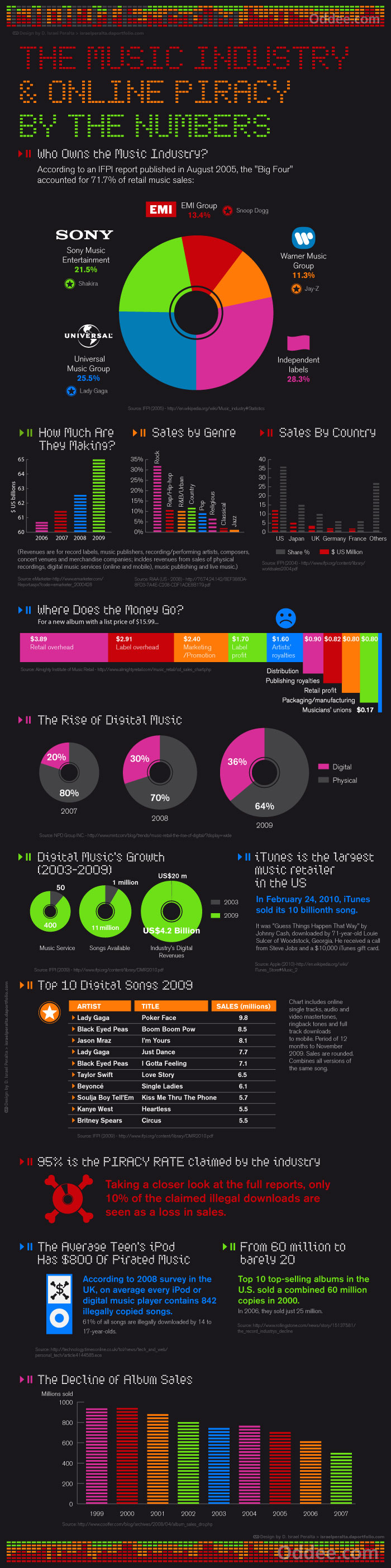
Music And Piracy Infographics
Clean and themic infographics on the music industry and online piracy. The appropriate use of digital style type and the use of equaliser style bar charts gives the whole piece a overarching theme that works well. The use of colour is interesting and draws your eye to key points in the infographic. The breakdowns are easy to understand and note the trends. Structure of the whole piece works well and the information moves between each progressively and interestingly.
Saturday, 17 April 2010
Jason Hill - Pictograms
Rodrigo Müller - Pictograms
Clean and simple pictograms by Rodrigo Muller that get across the point of the image with minimal identifiers. This type of work is something i need to look at for the next part of the charity brief, as i will be creating boards with information to teach people in ELDC's. Getting across information easily and simply will be the key to this brief.
The iphone - takes the simple lines that are easily recognisable as the iphone and removes all else. It says iphone with only the most simple of lines at a single weight.
Bluetooth - simple and effective, the tooth shape is recognisable to anyone, and then keying into the colour gives you the result.
Pentagram
Pentagram is one of the biggest and well known design agencies in the world.
Some of the projects that really caught my eye are;
AkzoNobel - this is a visual identity for a leading manufacturer of paints. The mixture of clean black and white photography, with bold marks of gradiented colour make an excellent contrast with each other. It brings out the theme across the branding of "seeing the world in full colour". The sans-serif typeface cuts through the colour in negative in some parts, in others it has a gradient fill. I like the balance of greyscale to colour. The colour is used just enough to stand out, and each whole piece is well balanced.
Saks Fifth Avenue - cutting up an image to create bold and interesting bags. The black on white keeps it simple counteracting the slight messiness of the overall design. By taking letterforms and cropping and mixing them, the letterforms speak of elegance while the composition keeps a modern feel. The type of bag used is a cubelike shape and plays well with the square cuts of the images of the bag itself.
Friday, 16 April 2010
Ctrl-Alt-Shift
Ctrl+Alt+Shift is a charity aimed at younger people to get people to interact with causes. The logo and name itself, play on the keyboard shortcuts on computers as well as the shortened names they are refered to on the keys. This is reflected in the logo as it uses the same bold sans-serif typeface that would appear on a computer screen, but the kerning is adjusted to bring the whole thing into a more logo shaped letterform instead of a group of text. I would say the logo is slightly misleading as it has so many references to computers but nothing but an slightly obscure charitable message that isnt at all obvious unless you know what the charity is about already. It does itself no favours in displaying what the charity is about, and to the layperson they may think it is something to do with computers.
oxfam logo
The oxfam logo is one of the most recognisable charity logos, as well as the trademark green colour for oxfam. The logo itself seems to be a combination of O and X letters for the OXfam. The letters make up a person as well as the shape of a ribbon, a common theme for a charity, showing the humanitarian aspect. The typeface is a simple bold sans-serif typeface, easy to read from long distances, as well as being clean and to the point. The whole logo feels friendly but serious. Its clear without being over the top with unneeded design elements.
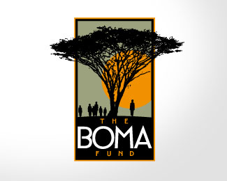
Boma fund logo
Boma fund logo. This is a logo for a charty that creates support programs to better the lives of tribesmen in kenya. I think this logo is striking at first look. It is memorable and has a air of respectability about it. The colour scheme works well with black being used to silhouette the figures and tree in the image. The tree works well to instantly remind of Africa, and the people give a feel to the people the charity is helping. I would say this logo may start to break down when viewed in small sizes, and the printing of the "THE" and the "FUND" may become lost at a smaller size.
Chariad Logo
Chariad logo. This logo is in my opinion reasonably weak. The logo imagery is of a figure, but is misshapen for no real reason. The text is in need of some kerning. The choice of typeface for the sub-title seems weak and unreflective of the charities aims. The red top of the I has no reason to be a different colour, it signifies nothing. The image is located off-centre and there doesnt seem to be enough thought put into the whole thing.
Live for the cure logo
Logo for live for the cure, a charity that raises money to help people with chronic illnesses. I think that this logo is only partially effective. placement of the C in cure is slightly too far to the right, giving the whole logo a unbalanced look. The ribbon works to signify charitable causes and its a common theme. This common-ness gives the ribbon power as a instant signifier of a charity. The ribbon being reversed however, could be construed as a anti-ribbon, something the charity wouldnt like to reflect.
Monday, 12 April 2010
Paul Fox Design
Subscribe to:
Posts (Atom)